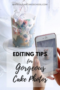
Do you ever catch yourself thinking “If only I had better photography skills”, or “If only my images looked as good as hers”. Well my friend, you’re not alone. I too know all too well what it’s like to contort myself in ninja positions, snapping countless images only to realise that none of them remotely resemble your finished cake. One can’t help but ponder… What am I doing wrong?
As many of us have already figured out, having consistently good cake images is imperative when it comes to running a thriving cake business in this particular era. With our social media platforms and websites acting as our online storefront, a common observation is that – cakers who take better snaps, are better able to pull ahead of the pack.
In my last blog post, I shared about my ‘Top Instagram Strategies for Cake Business’ and thought it would be helpful to follow up with a related topic; one that will help you create better cake photos which you can then confidently release to the masses.
But before we start, here are 2 insider secrets about taking gorgeous cake photos for posting on social media:
- It is possible to take incredible images with both a smartphone and DSLR
- Your most fave cake pics online (that you see on other bakers’ feeds) are almost always EDITED.
Well now, just HOW does one go about editing their cake images? For a start, I would recommend downloading my Free ‘Instagram Tools Guide’ where I share the editing apps that I prefer to use for smartphone cake pictures. For DSLR images, you can use Adobe Lightroom, Photoshop or similar and apply the same points discussed in this article.
Sooo… what’s the deal with EDITING and is it really worth the time and effort?
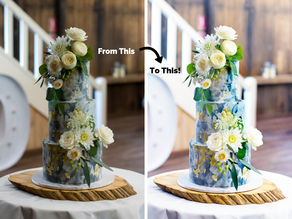
Well, here are my 2 cents on the subject: From observation of growth on both my Facebook and Instagram accounts in the past few years and measuring online sale conversions, I would surmise that Editing is a crucial step before hitting ‘Post’ or ‘Publish’ on socials as it helps our cake images return to a truer representation of what our cakes look like in real life. Often due to lighting limitations, shaking, poor positioning or plain ol’ time constraints, our captured cake pictures often need a lil’ help to get them looking their absolute best.
So in this blog post, allow me to hold your hand and walk you through my Top 5 Editing Points to making your sweet snaps waaaay sweeter.
1. Exposure
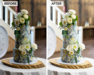
Exposure or brightness is the amount of light that is present or introduced into your image. The first edit I always make is to boost up the Exposure of my cake image to brighten it up. This always helps to take care of unwanted shadows, make the details on your cake more noticeable and create an attractive “airy” look around your images. Be careful to not overexpose your images as this can make cakes look “washed out”.
2. Saturation
Most of the time when we take an image, one of the things we’ll notice is that the colours on the actual REAL cake itself are richer and truer than the picture we’ve captured. With this, comes the need to boost up the Saturation or Vibrancy of the image. So go on an increase the Saturation on your image to give more depth to your dessert colours. On the flipside, going overboard with the Saturation can often make your cakes look “animated” and unrealistic.
3. White Balance
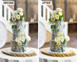
What is white balance? Well, often times when a white cake or white backdrop is captured by a camera, upon close inspection, you’ll notice that the white tones in real life don’t always come through as white in your captured shot. White balance is measured by the “colour temperature”, and can be manipulated in the post-editing process to determine the “warmth” or “coolness” of the image. Warm images tend to have a yellowish hue whilst a cool image, has more of a blue-ish tinge.
Before tweaking the white balance setting, determine first of all what type of “colour temperature” you’d like to consistently have your images in. Some social media feeds tend to have warmer images whilst others, a cooler aesthetic. I personally prefer to have mine sitting somewhere smack bang in the middle of the two. There isn’t a right or wrong, it just boils down to what appeals to your natural preference and tendencies. It also hinges on what suits your cake designs best. Warm images can inflict a cosy, ambient vibe white cooler images can give a crisper, minimalistic feel.
The best way to tell is to play around with the white balance toggles and settle on something that shows off your cake best. Tweaking the white balance is especially necessary to neutralise unwanted lighting hues (i.e. yellow ambient light at event venues). I personally recommend adjusting the white balance on your image so that it’s not sitting at either extremities and is something that is comfortable and pleasing to the eye.
4. Contrast
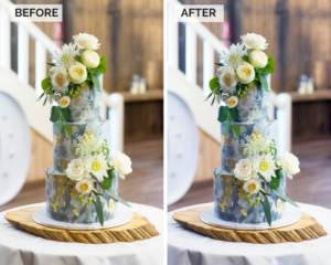
Adjusting the contrast can often bring out the finer details in your cake design. I find cakes with elements such as florals, texture, ruffles and intricate patterns do well with a slight boost in the contrast setting. There are situations however where increasing the contrast can backfire and this tends to happen more in images that have excessive shadows, or an entirely monochrome palette. So be aware that in some circumstances, it’ll be better to leave the contrast settings as is.
5. Shadows
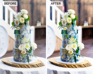
Shadows can add depth & a certain moodiness to an image, so in some circumstances, shadows can be a welcome addition to a cake or dessert image. Often times however, harsh shadows (that are a result of photographing in harsh lighting coming from one direction) can make an image look overcast, so one of the things we can do to address this is to remove the shadowing in our image. That said, reducing the shadowing can often reduce the contrast of the image somewhat so be careful to balance the shadow reduction so that it doesn’t take away from the overall contrast of the subject matter.
6. Rotation & Cropping
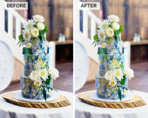
Crooked cakes… it happens ALLL the time, especially if we’re not using a tripod to capture our cakes. This is especially so when trying to photograph a cake from a straight-on, front angle. No worries! After making all the prior colour and tonality edits, its then time to crop or rotate the image to make sure it’s at its best and proper angle.
7. Sharpening
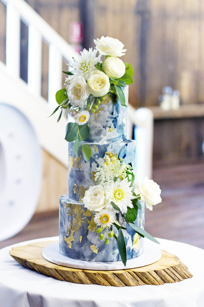
Not all editing apps have this feature, but it’s one that I like to do within the Instagram app just before hitting Publish! I find that it gives my all cakes & desserts across the board a crisp finish, whilst bringing out a lot of the gorgeous details. It’s especially handy to remedy any accidental “shakes” and blurriness in our baked pictures.
*A note about filters: I personally recommend staying away from applying full filters as they can leave your images with an over-edited, unrealistic finish. I would however encourage you to experiment with using filters partially (a percentage of a filter) as it certainly can shorten the amount of editing time of an image. My personal faves are in the editing apps listed in my ‘Instagram Tools for Cake Business’ free pdf guide.
I’d love to know, how do you normally take your cake pictures and has this article helped you?






4 Responses
Hi Amanda, this is a brilliant post. I usually just snap away with my phone,but from now on, I’ll ‘fix’ my cake photos before posting.
Thank you so much, very helpful.
Hi Amanda, thank you for this amazing post. Quite helpful 😍
We offer affordable prices and significant discounts for bulk professional photo editing services. We charge reasonably for our service and provide the most reliable and top-quality service. We provide image editing, Graphics design, Video Editing, Web Design, and Development services. We care for our customers, their time, and their cost!